Visualizations
Inside a visualization you can format the items in a way which makes it easier to read the data. Especially when looking at the data on mobile, there is a lot to be gained by choosing good names and colours. Let's take a look at how to build a good visualization.
Note that you will need to be the owner, or be granted admin or editor privileges on a timeline in order to edit it. If you want to share a timeline with others, but don't want them changing your setup, you can use the viewer permission which will allow them to view data and add comments.
Creating a visualization
To create a new visualization, we need to be in a timeline where we have at least editor permissions. We start by clicking the "+" button which will open up a panel with all our items. With this panel open, drag an item onto the timeline or press the "+" button that appears when hovering over the item. This will create a new visualization.
Note that pressing the "+" button will always cause a new visualization to be created. If you want to add items to a visualization, you need to drag and drop them into place.
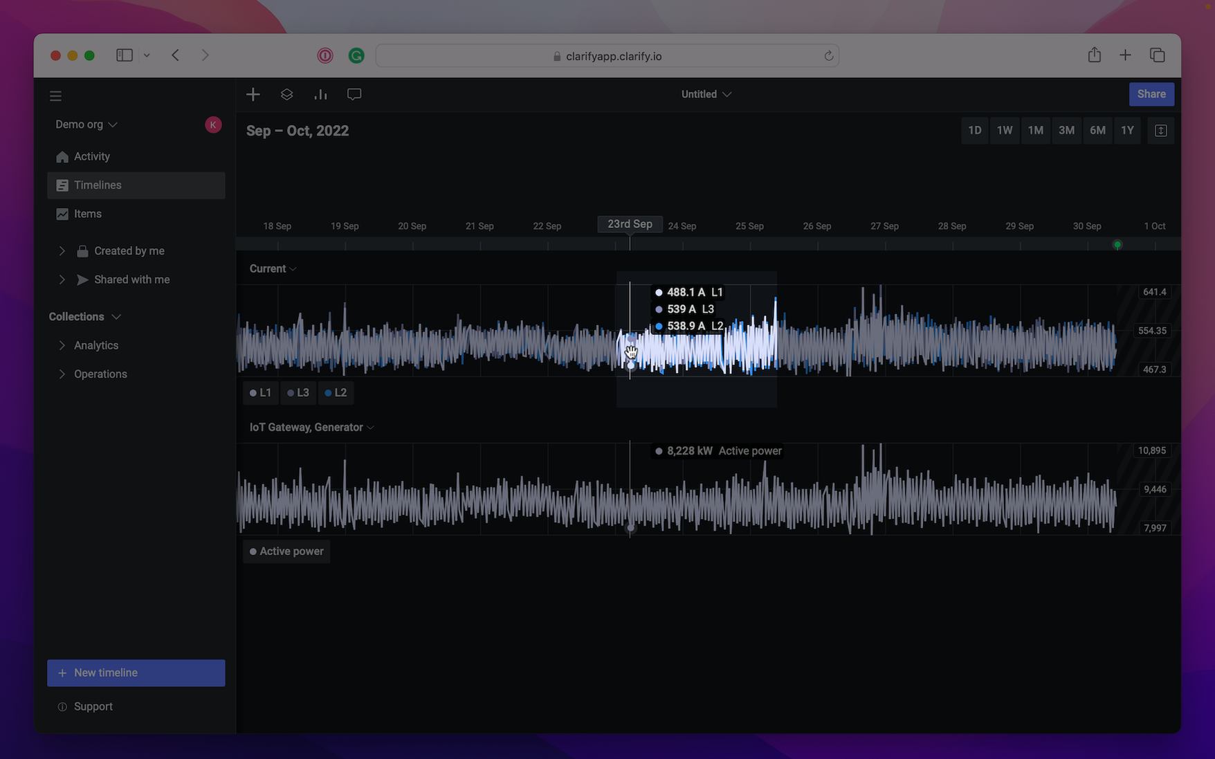
Looking at the timeline now, we have created two visualizations. The top one contains three items, named Current L1, Current L2 and Current L3, while the bottom one contains a single item called Active power. Lets see how we can improve the readability of the first visualization.
For most cases, there is a basic four step process we can follow which will greatly improve how your visualizations and timelines works.
- Naming
- Colour
- Scale
- Change size of visualization
- Ordering
Naming
Let's start by step one, naming. In the screenshot above, you'll notice that our visualization has a temporary name based on the labels of the items. Before we change the name of the visualization, its important to note that we can override the names of the items in the visualization as well. This allows us to combine the name of the visualization and the items in ways which makes it easier to navigate the timeline, and to read the values of the items.
In this case, our three items are names Current L(1,2,3) which means naming the visualization Current and setting the item names to L1, L2 and L3 will let us differentiate the items while being a lot shorter. Let's do that as well and we'll see why this improves the readability of the visualization.
With both the visualization and items named, you'll notice there is a lot less repetition of text. In addition, when reading the values for the data, the readout view will contain the item names we set, which will help when viewing it on mobile.
Colour
With step one and two done, let's look at the colour of the items. In some cases we might want specific colors for certain items, either to replicate how it looks in some other system, or there might be a colour scheme that is commonly used in a domain. For most cases though, choosing colours is about making it easier to distinguish the items in a visualization from each other. In our visualization, we'll go ahead and choose three bright colors which will be easy to tell apart.
Scaling
The next way we can make our visualization easier to read is to choose how we want the graph to scale when the values change. Here we have two options, we can let Clarify decide how to scale the graph based on the content which is visible at any time, or we can set fixed limits.
By default the visualization is set to automatically scale, but lets play around with the setting to see what happens. In the video below, you'll see the difference between auto-scale and defining the scaling manually.
Change size of visualization
Another way to make visualizations easier to read is resizing them. There are three options available; compact, medium and spacious. This way we can enlarge the visualizations to more easily read the data or make the visualization more compact and be able to view multiple visualization at the same time.
Ordering
We've now reached the fourth and final step in our process for customizing visualizations. Here we'll go through the ordering of the items which is a small, but surprisingly handy feature. You'll probably have noticed by now that our items are added in the order L1, L3 and then L2. This looks a bit weird, and it's not unlikely that someone will read the values as L1, L2, L3 if they aren't paying that close attention. To fix this, we will need to open a new menu that shows the order of all visualizations and items in the timeline.
From here we can re-order the items of any visualization, which in this case we'll use to make sure our items are in a more natural order. Notice how after re-ordering the items, both the legend and the order of the items in the value readout changes, making the entire visualization easier to understand.
You can also re-order visualizations this way, or even move an item from one visualization to another. Make your own timeline and spend some time playing around with the feature to get to know it!