Introduction
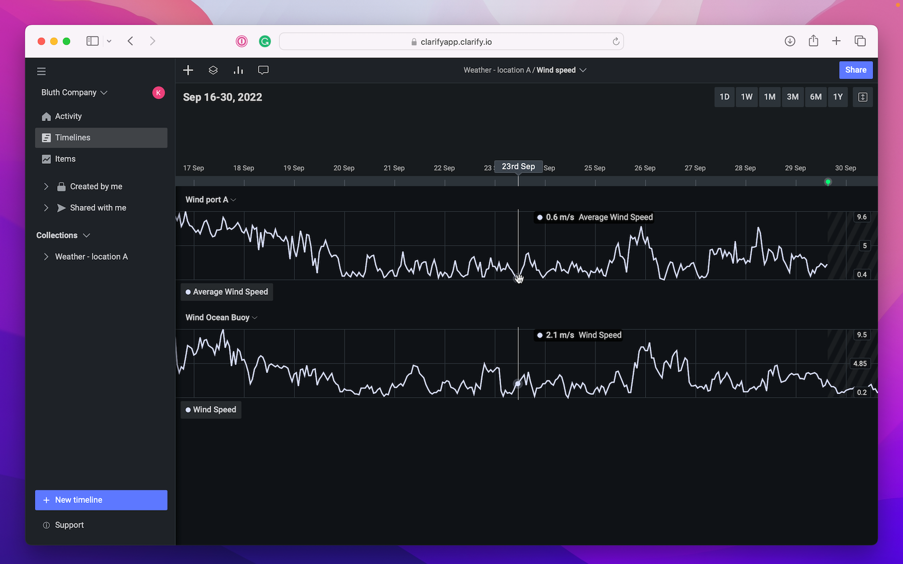
Timelines are one of the most important concepts in Clarify, this is where you will likely spend most of your time in the product. The structure of a timeline consists of some key elements that are important to understand, so let's start by breaking down the individual pieces of a timeline and discuss how to interact with each of them.

Navigation bar
The navigation bar has multiple functionalities. You can hide the side menu by pressing the left side menu icon. Add items to the timeline by pressing the plus sign, inspect the content of the timeline and look at statistics. You can also open the thread feed, change the name of the timeline and share the timeline from the navigation bar.

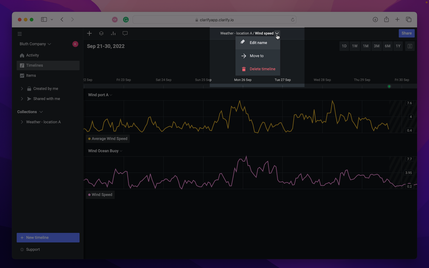
To change the name of the timeline simply click the name of the timeline and type the new name. If you press the arrow next to the name you get the option of editing the name, move the timeline to a collection or delete the timeline.

Just below the navigation bar the time of the current view is shown. On the right side you can change the zoom level by selecting one of the options (1 day to a year). The button on the far right is where you can change the height of the visualizations. You can have them compact, medium sized or spacious.

Comments
The next area we'll cover is the comment section, here you will see all comments that has been added to the timeline. To open a comment, simply click it. This will open a panel that shows you the original comment, as well as any replies that has been added. Read more about comments on web or mobile.

Time
As we briefly saw when looking at comments, just below the comment section you'll find an element that shows the time.

- Web
- Mobile
Now lets take a look at a video showing us panning and zooming to see how the time changes, as well as demonstrating how you can select a period of time.
To explore your data in a timeline there are multiple functions available on mobile. You can zoom in on time, select a period, show values and comment on a period or point in time.
Zoom
To zoom in timeline use two fingers and drag them out to zoom in, and pinch them together to zoom out.
Tap
To show the values at a given time, press the screen and hold. A line will appear and you can swipe it where you want to see the values. At the bottom of the screen, a "Add comment" button will appear which allows you to create a comment to that point in time.
Visualization
If you wish to explore a visualization more you can open the visualization view by pressing the arrow on the right to the visualization. Here you can edit the visualization name or remove the visualization (if you have admin or edit rights), just press the "..." next to the visualization name.
You may also hide items you no longer want to see in the visualization or remove an item if it is no longer needed. It is also possible to change the name of an item. The item view can also be opened from here.
Editing visualization is only available on iPhone at the moment.
Period selection
Select a period of time and get values such as max value in that period, min value, average value, sum, and the number of points in that period. To select a period, use two fingers and hold them for a while and then pinch or drag them to select the correct period. To view the values, press the arrow next to the visualization you wish to inspect and the values for the different graphs will show.
If you wish to comment on a period, just press the "Add comment" at the bottom of the screen. You may also export the data in that period by pressing the export button right next to "Add comment".