Create your first board
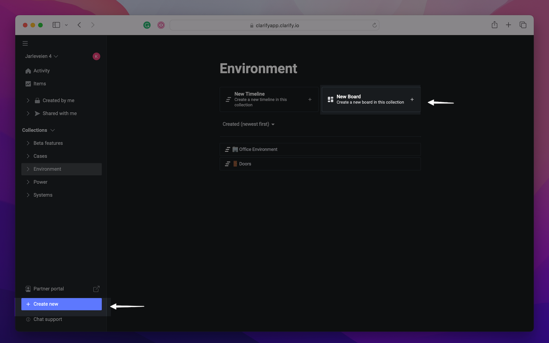
Start by creating a new board, either by opening in the collection where the board should live, or by pressing the "+ Create new" at the bottom of the left side menu. In this guide we will create a board for showing power usage and temperature in our office.
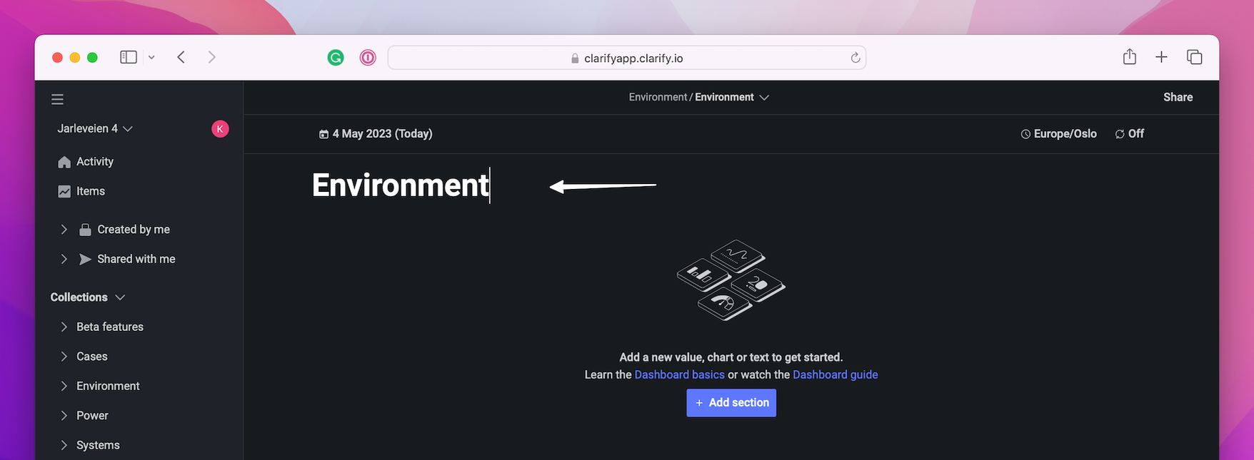
Add a name for the board, in our case we wish to have a report on the electricity in the office and will call it "Environment". As you can see we already has a timeline called "Environment", but we want a board that shows us the current status as well. Press the "Untitled board"-header and change the name.
Then we start by adding a section to our board. Press the "+ Add section". We get a choice to choose "Metric" or "Time series". We go for "Time series", but if you choose the wrong one you can just switch in the next step.
Naming
Each visualization has their own name, it is useful for understanding what the data displayed is showing. Setting a name is done at the top of the screen when creating a visualization. The first visualization we will name "Temperature".

Select item(s)
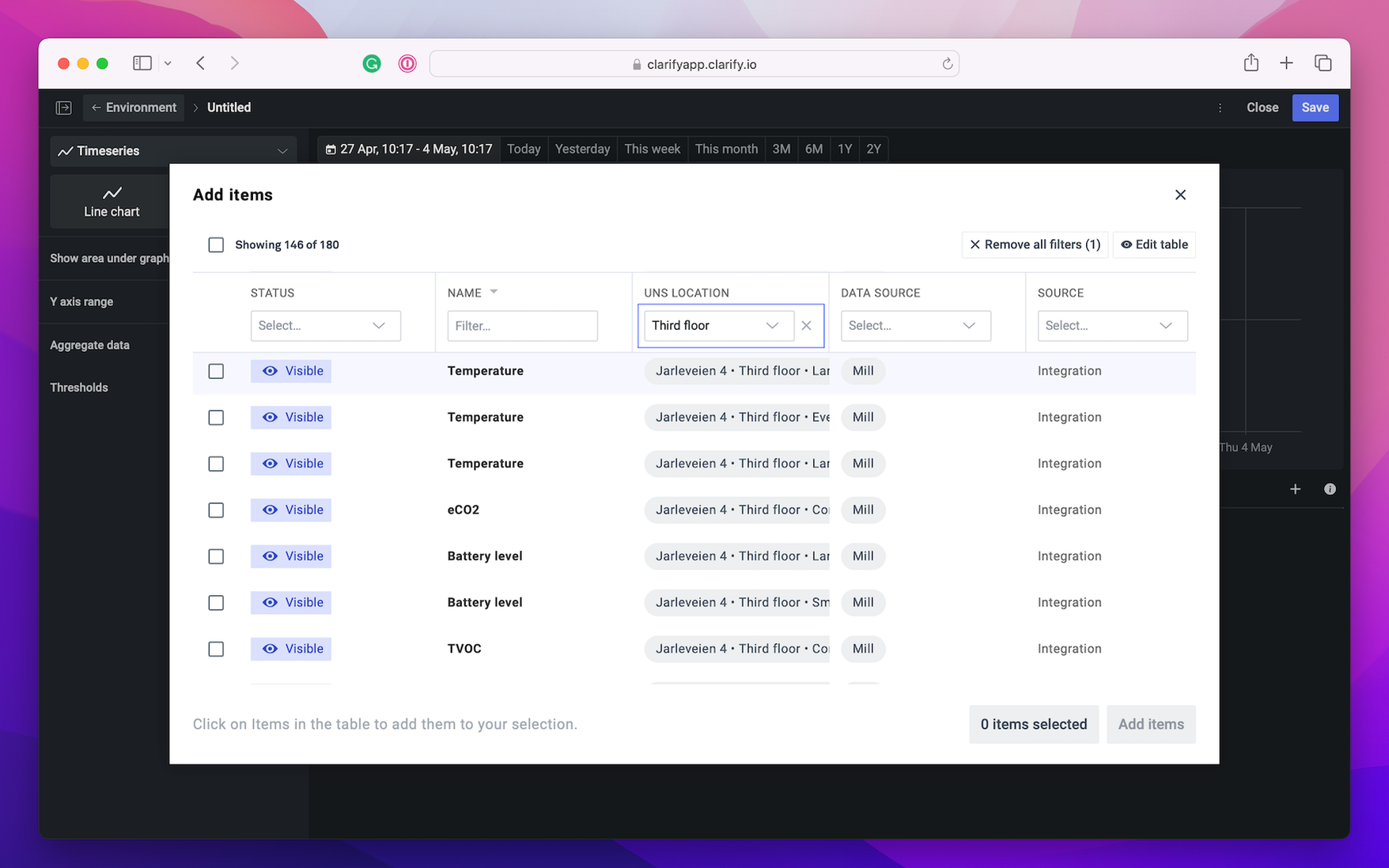
Press the "Add item" button and an item picker view will appear. Here you can filter items on status, name, location, data source and source.
Item explanation
The points below refer to numbers in the image.
- Show or hide the item in the board.
- Change color of item.
- Set a name for the item. If no name is set it uses the item name, which in this example would have been "Temperature".
- Set unit. In some cases the items does not have a unit, or perhaps the unit name could be improved. If it is not changed here it will use the unit of the item.
- Alias. This will only appear if you have a calculation, and is auto generated. But to make the calculation easier to read it is nice to change the alias to something that makes more sense.
- Aggregation value. This will only appear if set your data to aggregation. Here you can choose between average, minimum, maximum, sum and count.
- Time-shift. Here you can time-shift your item into the future or back in the past.
- Duplicate. Duplicating items might be most useful in calculations or time-shift.
- Delete item.
- Add a new item.
- Turn on/off aggregation.

Choose time
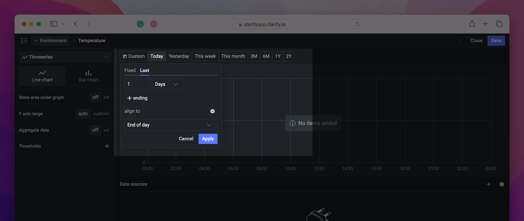
On top of the block there are different times to select from; custom, today, yesterday, this week, this month, 3 months, 6 months, 1 year and 2 years. The time selected here is only valid for the current visualization. Each visualization in a board could have different time settings.
- Today will show this day, from midnight to midnight.
- Yesterday will show yesterday from midnight to midnight.
- This week will show from monday to sunday. Start of week could be changed in the board settings.
- This month will show from the first day of current month until last day.
- 3 and 6 months will show the the last three or six months, ending with current months last day.
- 1 and 2 years will show either the current year from January 1 to December 31, or the previous year and current year.
- Custom makes it possible to change each time setting. If you wish to show more then one day then select the number of days you want. You could change the week to show more weeks and change from current week to the last week from current date. If you add an "ending" to the custom view, then you will move the week to end at the set day.
Time series
Time series could either be visualized as a line chart or as a bar chart. The visualization shows data from a certain time range, either as raw data or as an aggregation of data.
Line chart
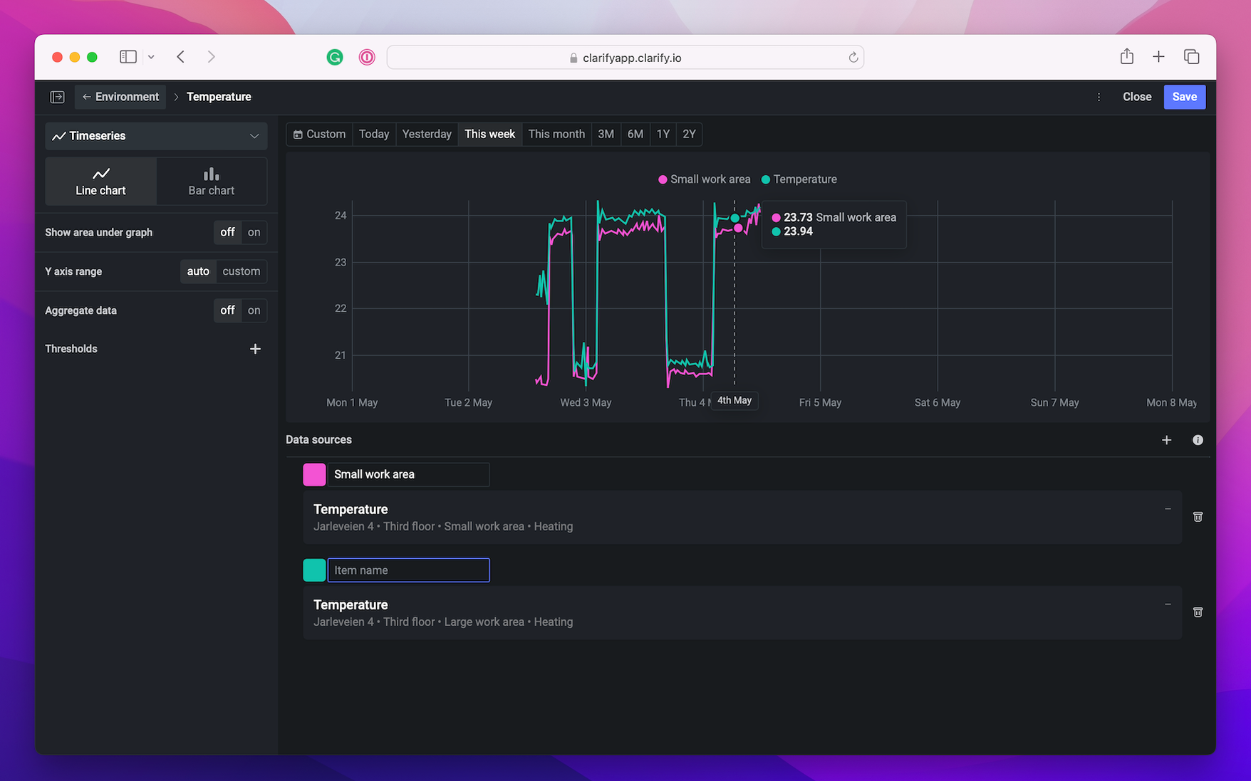
The first visualization we create is a line chart with the temperature in our office for the last week. In the left side menu we see that "Timeseries" is selected, and below that "Line chart" is highlighted. We don't want aggregated data and do not need change any of the other settings to show the temperature.
The items we picked was temperature in our small and large work area. The color of the graph is automatically set to blue, so it is recommended to change each item to different colors to make it easier to distinguish between them. In addition it is nice to set a name for each item, we have changed the first item name to "Small work area", and the second one is going to be "Large work area". If nothing was changed in this visualization both items would have been dark blue and called "Temperature".
Remember to press "Save" and go back to the board.
Bar chart
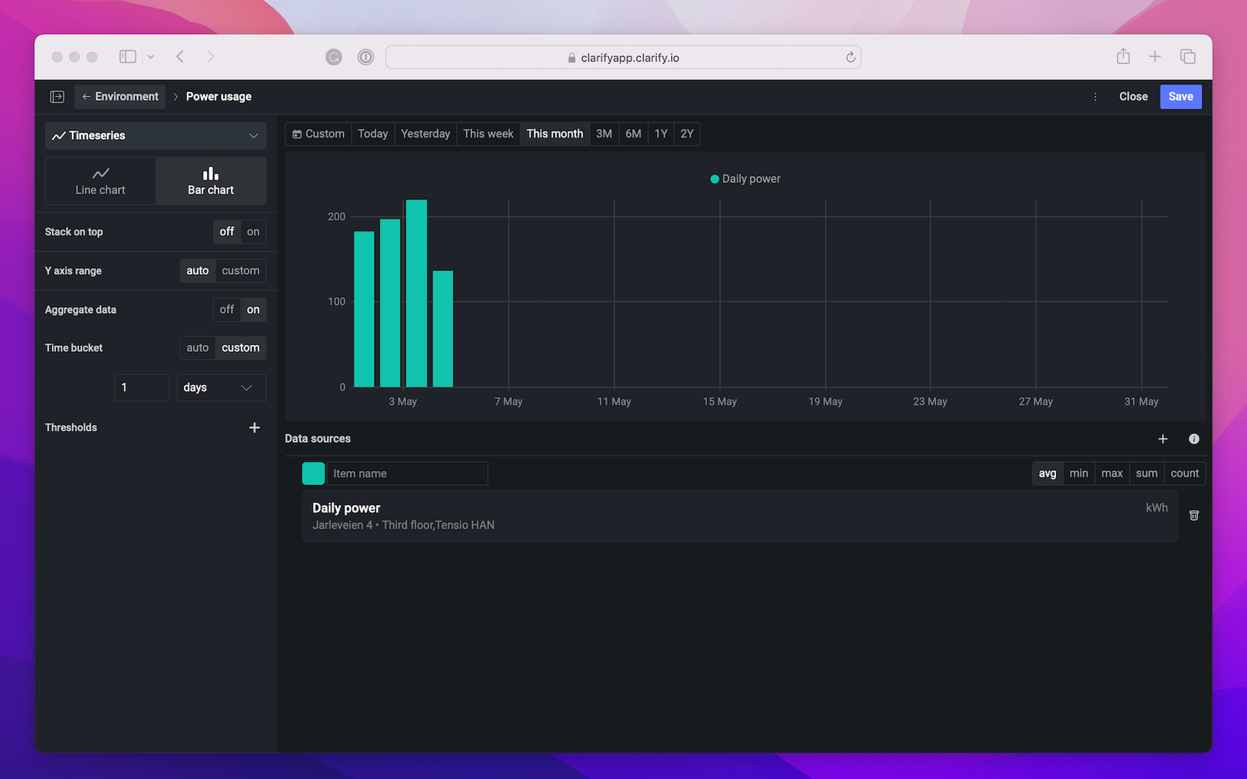
We also want to have a bar chart with the power usage in our office for the current month. This is done by adding new visualization to our existing section. We set the visualization name to "Power usage" and add an item just like in line chart, but here we only want one item. There is no need to change the name of the item since it is the only item and the name makes sense for our usage, but we want to change the color.
Bar chart can show the items side by side or stacked. In this case we just want the default, not stacked on top. There are multiple customizations available, such as setting the y-axis range, have the data aggregated, set the time-buckets and add thresholds. We want to change the data to be aggregated to average, and to set the time bucket to 1 day.
Metrics
Next up is creating a metric value/single value.
A single value could be either the last available value depending on the time frame set or an aggregated value. The value created can be visualized in one of two ways; single value or gauge. We will start by creating a single value.
It is possible to select more then one item in a visualization, but you have to select which item to show. This is mainly used for calculations where you need more items to create a calculation.
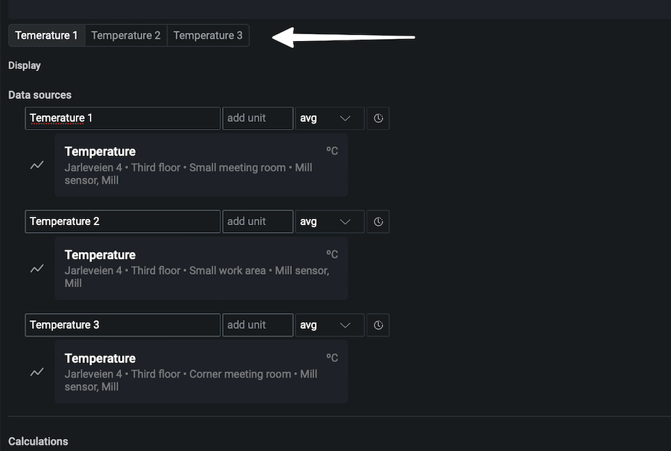
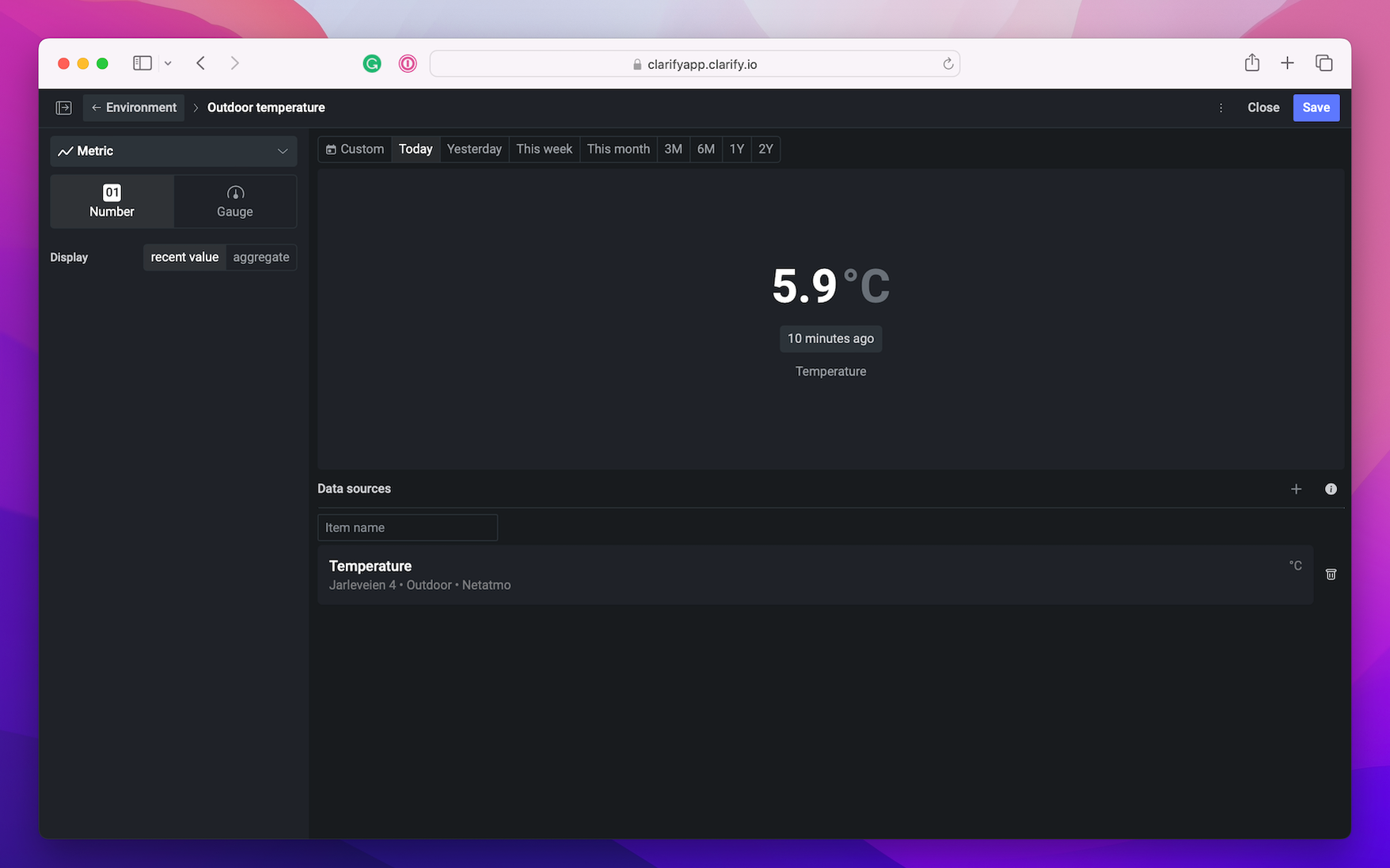
In our case we want to create a single number to show the outdoor temperature, and two gauges to show the current indoor temperature.
Single number
We create a new section and add a Metric value. Select "Number" and set the visualization name. Add the item you wish to show, in our case the outdoor temperature. In the left side menu set the display setting to "recent value". Since we want to know the current temperature we set the time to "Today".
Gauge
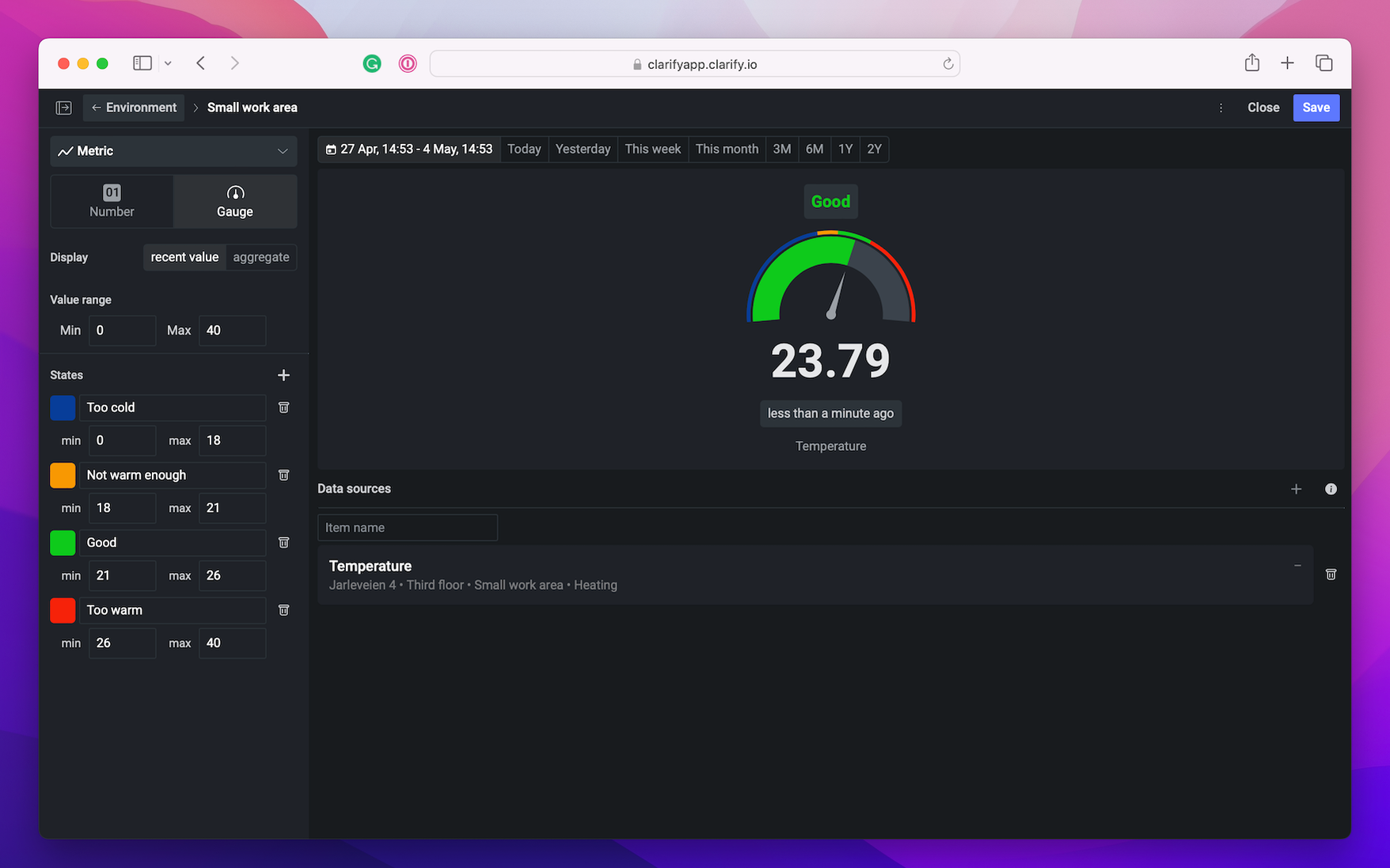
When creating a gauge the value range need to be set, this will be the max and min of the gauge. In addition one can add states, and set different colors for each state. The state will make it easier to quickly figure out if the value is an acceptable range.
In our case we want to quickly see if the temperature in our office is in an acceptable temperature range. The easiest way to do this is by creating a gauge. Select an item and decide if you need recent value or an aggregation. We picked the temperature for the "Small work area" and set the value range from 0-40 degrees.
To create a gauge you need to select an item and set the value range. In addition you can set the different states with different color and name, this makes it easier to quickly see if the value in your gauge is in an acceptable value range or below/above the wanted range.
Add new section or visualization
In the board there are two options for creating new visualizations. Either press the "+ Add section" to create a new section, or press the "+" button next to an existing section to add a new visualization in that section. Each section can have up to four visualizations.
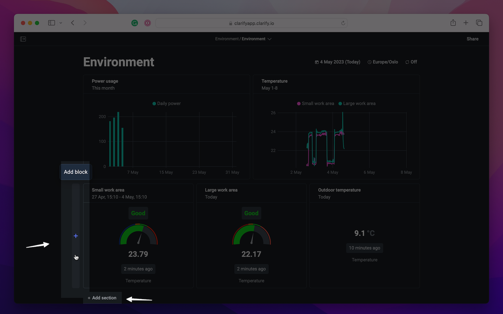
If you wish to change the order of the visualizations it is possible with drag and drop.
Duplicate visualization
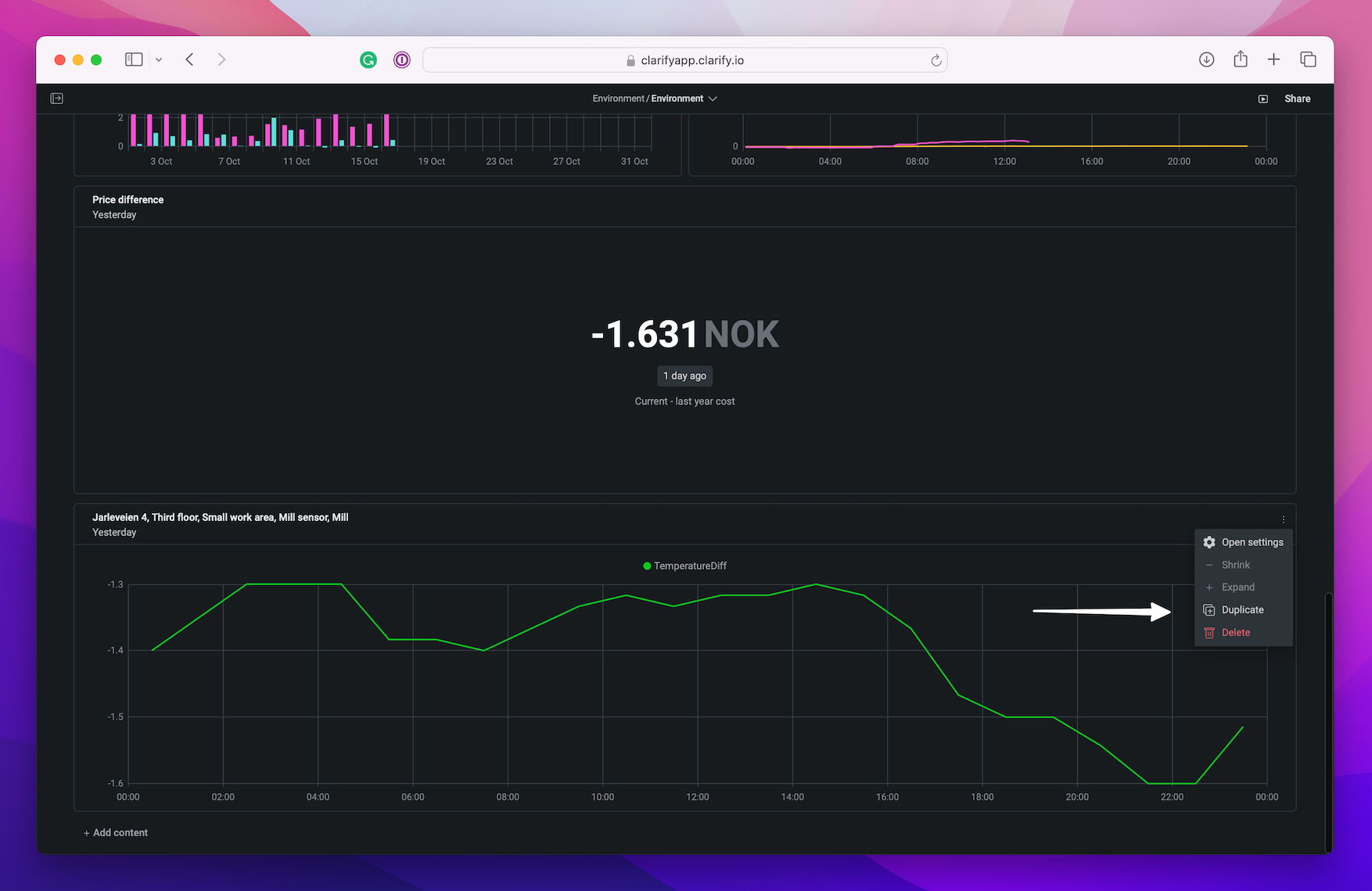
Duplicate a visualization by opening the menu on a visualization and press the "Duplicate" button.
